

Loyaone
Presenting a loyalty platform through the everyday value of earning rewards and building lasting customer relationships.
- Role
- Frontend
- Year
- 2023–2024
- Industry
- Loyalty & rewards
- Platform
- Web

01 / Overview
The context
LoyaOne connects customers who earn rewards with businesses that run loyalty programs. Its public website speaks to both audiences, explaining points and benefits alongside tools for merchants. The frontend challenge is to make each audience's next step easy to understand while giving the experience a coherent visual language.
What I worked on
- Frontend implementation for customer and business-facing content.
- Consistent page sections, navigation, and calls to action.
- Responsive presentation of product imagery and supporting information.
Stack & tools
- Next.js
- Redux
- Redux Toolkit Query
- Radix UI
- Tailwind CSS
02 / A closer look
The work, in detail.
01 / Journey
Making the value of rewards clear
LoyaOne serves two audiences with different questions. Customers want to understand points and rewards; businesses want to understand how a loyalty program fits their operation. That distinction organizes the experience, giving each audience a clear route into relevant product information.
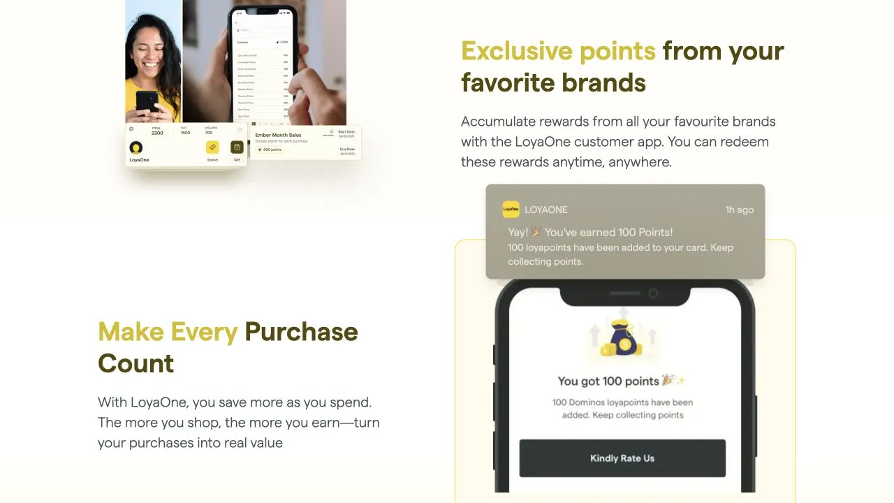
For the customer story, the useful sequence is purchase, points, then redemption. The rewards section makes that relationship visible through product imagery and short explanations. The merchant story can then concentrate on running a program, with its own examples and actions instead of mixing both messages together.
- Choose an audience
- Explore the benefits
- Understand the process
- Take the next step
02 / Interaction
Keeping navigation and feedback predictable
The Customer and Business routes represent a change of context. I kept the selected audience legible in navigation and matched each page's primary action to its purpose. This prevents someone from reading a customer benefit and unexpectedly entering a merchant-oriented flow.
Smaller interactions deserve the same clarity. For an email form, an invalid address, a submission in progress, and a completed request are different states. For an FAQ, the question remains the control, while the expanded answer follows in the reading order and stays accessible from a keyboard.
- Visible context
- Keep the active audience identifiable and make each action's destination clear from its surrounding content.
- Local feedback
- Place validation and submission messages next to the email field without replacing the surrounding page.
03 / Architecture
A shared language for two product stories
I treated feature sections as a small set of repeatable content patterns: a benefit, an explanation, a supporting image, and an optional action. Shared layout rules connect the pages, while the content itself remains specific to customers or merchants rather than being forced into identical wording.
The tradeoff is between consistency and flexibility. A rewards explanation may need layered app imagery, while a business section needs a dashboard preview. Explicit compositions keep those differences manageable while sharing typography, spacing, and action styles across both parts of the site.
- Share the foundations
- Reuse section spacing and action treatment while allowing imagery to follow the purpose of each explanation.
- Keep content together
- Store each feature's heading, copy, image description, and destination as a coherent unit during page composition.
04 / Responsive
A product story that fits smaller screens
The desktop compositions give app screens and reward cards room to overlap. On mobile, I treated those images as supporting evidence rather than a layout that must stay unchanged. Text leads, the relevant preview follows, and the next action remains associated with the benefit it describes.
Navigation also needs to preserve the distinction between Customer and Business when horizontal space disappears. Clear active states and comfortable controls matter more than squeezing the desktop header into one line. Longer FAQ answers and form feedback need enough room to expand without covering nearby content.

05 / Quality
Checking the whole visitor route
I grouped the review around visitor routes: choose an audience, follow a feature, open a question, and use the relevant action. This makes mismatched destinations and inconsistent navigation easier to spot than reviewing each section alone. The customer and merchant journeys need their own complete pass.
The content checks include long headings, missing or slow product imagery, expanded answers, and invalid form input. Keyboard focus must remain visible throughout. A convincing product story depends on those ordinary details continuing to work when the page contains something other than the ideal example.
03 / Looking back
Outcome & reflection
The website provides separate entry points for customers and businesses while presenting a shared loyalty service. Visitors can explore the relevant benefits before moving toward the app or merchant offering.